How to use gradients in .NET MAUI
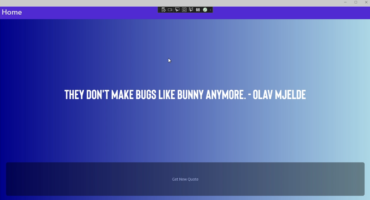
Gradients are a very simple way to add a better visual ...

.NET is also an open-source platform, with a growing community of developers contributing to its development.


Hi Devs!
Nice to have you around.
Nice to have you around! I'm launching a new personal project in the English language, where I plan to publish a lot of content related to software development.
And what better way to launch the site, than sharing my contribution to the .NET MAUI Beautiful UI Challenge.
The purpose of this post, is to explain you a little bit how the MAUIDelivery application is composed.
I want to clarify, that the application uses preloaded information at the beginning of each window, so you shouldn't be surprised if you select an element of a collection and it shows you another one in the next window.
Also, being a UI challenge, there are some uncompleted functionalities, such as the map functionality. Additionally, being a weekend project, there are many things to be polished, such as the addition of resource dictionaries for the reuse of styles, or the implementation of the mvvm pattern, which can remain as a personal challenge to be done.
Finally, I want to give special thanks to my friend Galo Galvez, who was a key piece in the realization of the project through their feedback.
Still, I think it's a pretty good looking application. Without further ado, let's get started!
This is the Home Page of the application, in other words, the Login page.

Logo created for the application
1 of 5Lottie animation running thanks to SKLottieView control
2 of 5Use of the frame control to achieve rounded corners (although there are many options to achieve the same effect).
3 of 5Use of fonts for a customized visual appearance
4 of 5Using FontAwesome as an icon library
5 of 5The page makes use of rounded edges in various sections, to give an interesting appearance. In the case of the white section, a frame was used, although there are many ways to achieve the same effect, either through a BoxView or a RoundRectangle. In the case of the image, it is achieved through the following code:
					<Frame
                Grid.Row="1"
                Margin="0,-30,0,0"
                CornerRadius="25">
As part of the application, extensive use is also made of icons, so the FontAwesome font is used, which includes a large collection of icons.
An example of this is the use of icons to show the user that an email and password are required. Each icon is located inside a frame element, as follows:
<?xml version="1.0" encoding="UTF-8"?>
<Frame Padding="0" BackgroundColor="#EDEBF6" CornerRadius="10" HeightRequest="60" HorizontalOptions="Center" VerticalOptions="Center" WidthRequest="60">
<Image HorizontalOptions="Center">
<Image.Source>
<FontImageSource FontFamily="AwesomeSolid" Glyph="" Color="#4F3F9B" />
</Image.Source>
</Image>
</Frame>
This is the page for the user to register a new account.

The page contains a format very similar to the Login page, except that you are prompted for a name to register.
This is the page that shows the list of businesses from which you can place an order.
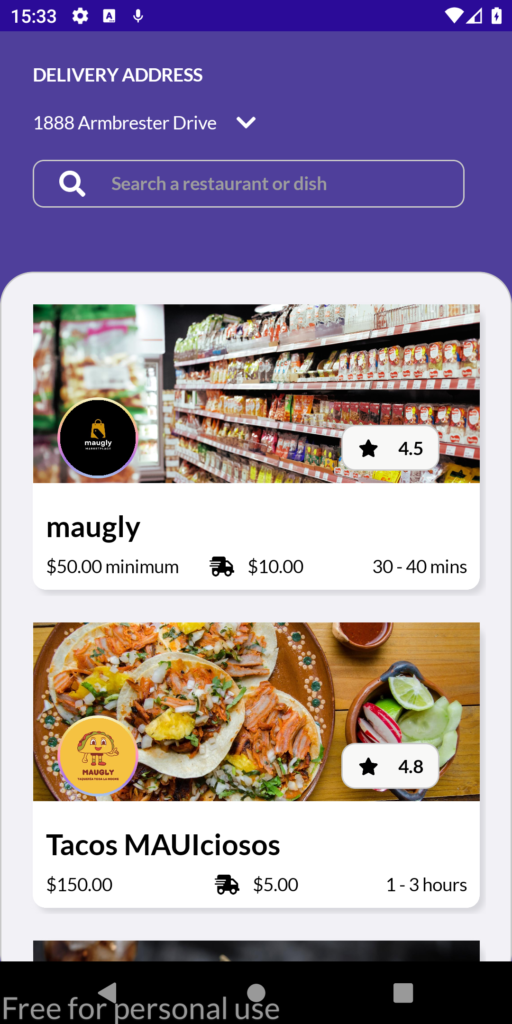
If you click on the arrow, the menu for selecting or adding addresses is displayed.
1 of 5Search box made from a combination of an image and an input control.
2 of 5Use of a border with a gradient applied on an Image control.
3 of 5Using shadows to create a card effect
4 of 5Use roundrectangle to create an outline only on the bottom of the cards.
5 of 5The page to view list of Stores, consists of several interesting elements. First, at the top, I added an icon to select or add delivery addresses, which we will discuss later.
Also, I created a search box from an icon and an Entry control, as follows:
<?xml version="1.0" encoding="UTF-8"?>
<Frame Padding="0" BackgroundColor="#4F3F9B">
<Grid>
<Grid.ColumnDefinitions>
<ColumnDefinition Width=".2*" />
<ColumnDefinition Width=".9*" />
</Grid.ColumnDefinitions>
<Image HorizontalOptions="Center" VerticalOptions="Center" WidthRequest="20">
<Image.Source>
<FontImageSource FontFamily="AwesomeSolid" Glyph="" />
</Image.Source>
</Image>
<Entry Grid.Column="1" FontFamily="bold" Placeholder="Search a restaurant or dish" PlaceholderColor="#9D9D9D" TextColor="White" />
</Grid>
</Frame>
I have used a Frame control to give a card-like appearance to each element of the CollectionView, and I have given each of them a shadow, which gives a very attractive appearance.
					<?xml version="1.0" encoding="UTF-8"?>
<BoxView Grid.RowSpan="2" CornerRadius="10" Color="White">
   <BoxView.Shadow>
      <Shadow Brush="#CFD0D4" Opacity="0.8" Offset="10,10" />
   </BoxView.Shadow>
</BoxView>
Inside the card, as an element to highlight, is the logo of each business, which is rounded and with a gradient border, which has been achieved thanks to a Border control as follows:
					<?xml version="1.0" encoding="UTF-8"?>
<Border HeightRequest="70" HorizontalOptions="Center" StrokeShape="Ellipse" StrokeThickness="4">
   <Border.Stroke>
      <LinearGradientBrush EndPoint="0,1">
         <GradientStop Offset="0.0" Color="#FEFEEF" />
         <GradientStop Offset="0.25" Color="#EBD570" />
         <GradientStop Offset="0.5" Color="#FF94C3" />
         <GradientStop Offset="0.75" Color="#A573E4" />
         <GradientStop Offset="1.0" Color="#A9E2EE" />
      </LinearGradientBrush>
   </Border.Stroke>
   <Image HorizontalOptions="Center" Source="{Binding Logo}" />
</Border>
As mentioned before, if we tap on the arrow next to the address, a control will be displayed from below that will show previously registered addresses, as well as the option to select a new address.
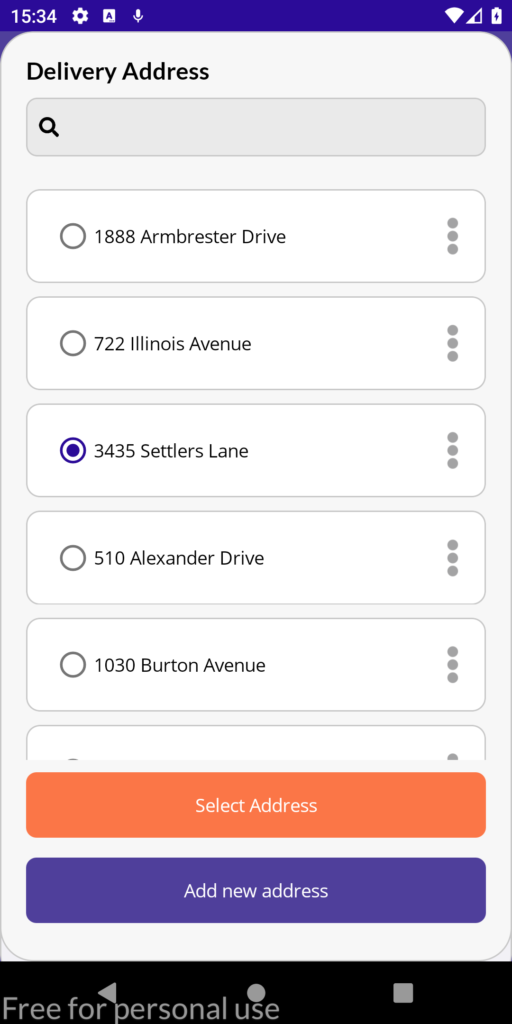
The address list is a Frame control containing a Grid to be able to size the address section and the buttons. For the scrolling effect to work, the frame must be named:
					<Frame
    x:Name="addressesList"
    Grid.RowSpan="2"
    BackgroundColor="#F7F7F7"
    CornerRadius="25">
Next, I have created a field in the code behind to store the height of the window, with the purpose that we know up to what position the Frame must be shown, this we can know it in the method OnSizeAllocated. In this method, we are also going to set the TranslationY property to 0 initially, to hide the Frame:
					private double height = 0;

protected override void OnSizeAllocated(double width, double height)
{
    base.OnSizeAllocated(width, height);
    addressesList.TranslationY = height;
    this.width = width;
    this.height = height;
}
With this we have done, it is possible to show and hide the Frame in a simple way, by clicking on a specific element of the screen:
					     private void SelectAddress_Clicked(object sender, EventArgs e)
     {
          addressesList.TranslateTo(0, height, 500, Easing.SinIn);
     }

     private void TapGestureRecognizer_Tapped(object sender, EventArgs e)
     {
          addressesList.TranslateTo(0, 0, 500, Easing.SinOut);
     }
This is the screen intended to allow the user to add a new delivery address.
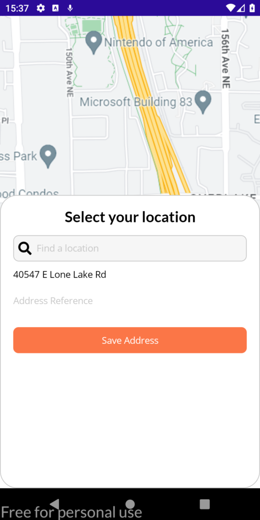
This is a very simple screen, which should allow the user to select a location from the map, and then display the street as part of the data entered. It should also allow the user to add references to the location.
Actually, the application does not make use of maps, and only shows an image as a placeholder.
This is a store page, which displays relevant information such as the rating and the categories that can be found in the store.
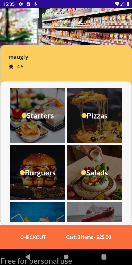
On this page, I used a CollectionView to display the store categories. The opacity is achieved by using a Grid over the category images, as follows:
					<Grid>
	<Image Aspect="AspectFill" Source="{Binding Image}" />
	<Grid BackgroundColor="Black" Opacity=".5" />
</Grid>
After you have selected a category, the page is displayed to show the products in the store.
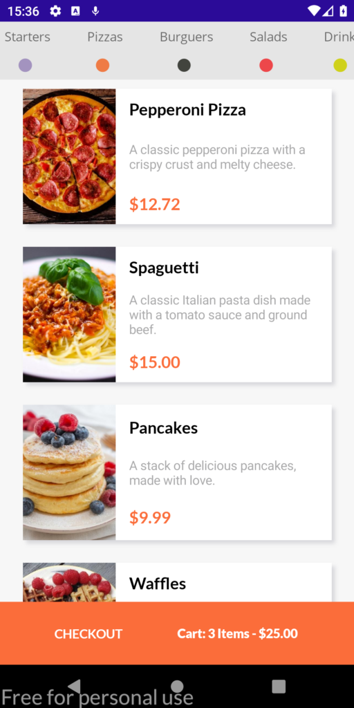
At the top, we have a CollectionView, whose purpose is to allow us to move between categories quickly.
The idea is to pre-select the item that has been selected on the previous page, and to filter the products by category, as it is not currently implemented.
On this page, again the elements are displayed in the form of a card with a shadow, being a Grid the one in charge of dividing the sections for each element of the card.
We can also notice at the bottom, an orange box that shows the order information such as the items in the cart and the estimated total. If we click on this element, we can go to the payment processing page.
This is the product page, i.e. where the ingredients of a product can be configured, as well as the Extras and supplements that can be added.
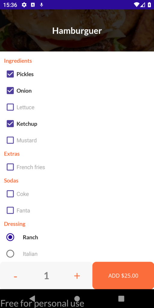
The great advantage of this page is that it has implemented the option to add as many add-ons as necessary according to a product. This is done thanks to the established class hierarchy.
					Extras = new List<Extra>
{
     new Extra
     {
          options = new List<Option>
          {
               new Option
               {
                    name = "Extras",
                    suboptions = new List<Suboption>
                    {
                         new Suboption
                         {
                              Name = "French fries",
                              Rule = EnumRule.Min0_Max1
                         }
                    }
               }
          }
     }
};
In the same way, each section is shown, because the CollectionView has been enabled to show groupings, which is filled thanks to the following code:
					var grouped =  from o in AllOptions
               group o by o.GroupName
               into groups
               select new OptionsGroup(groups.Key, groups.ToList());

Options = new List<OptionsGroup>(grouped);
Finally, the previous code shows the assignment to a property called Rule, which basically indicates the number of elements that can be selected as a complement. This assignment, serves to be able to apply a DataTemplate to each element of the CollectionView, with the purpose of showing a CheckBox or a RadioButton according to the established rule:
					protected override DataTemplate OnSelectTemplate(object item, BindableObject container)
{
     var collection = container as CollectionView;

     if (container != null)
     {
          var product = item as BaseOptionsItem;
     if (product.Rule == EnumRule.None)
     {
          return (DataTemplate)collection.Resources["checkOption"];
     }
     else if (product.Rule == EnumRule.Min0_Max1)
     {
          return (DataTemplate)collection.Resources["checkOption"];
     }
     else if (product.Rule == EnumRule.Min1_Max1)
     {
          return (DataTemplate)collection.Resources["radioOption"];
     }
     else if (product.Rule == EnumRule.Max)
     {
          return (DataTemplate)collection.Resources["radioOption"];
     }
     }
     return null;
}
At the end of the product configuration, the product must be added to the shopping cart and allow the user to continue shopping, so a PopAsync is made to the previous page by pressing the ADD button.
This is the payment page. In it, the idea is to be able to add new cards, as well as other payment methods (which is not implemented).
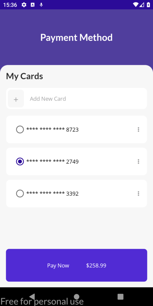
For this page, I reused the same layout of the addresses, as well as a frame with borders to show a nice visual appearance. The button with the + sign should be able to add a new card, however, this functionality is not implemented.
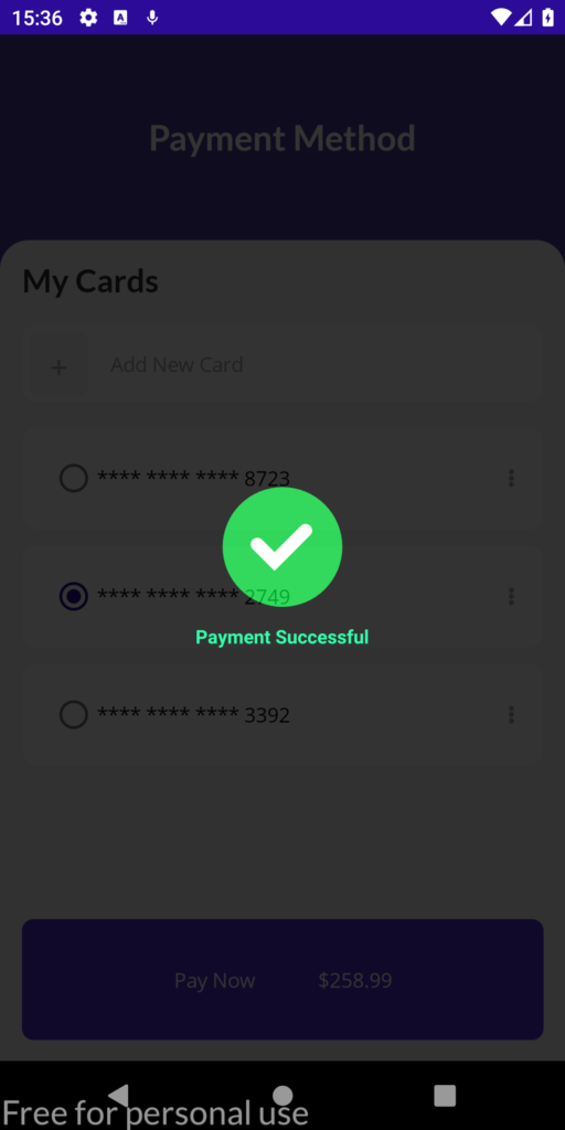
Clicking on the Pay Now button should initiate the payment processing. Currently only a Lottie animation is displayed showing that the transaction was successful:
With this we finish the analysis of the MAUIDelivery application. If you liked it, and want to see more content like this, feel free to leave me a comment.
To end this publication, I would like to tell you that I have created a .NET MAUI course, in which I deal with topics from basic to advanced, and I update it regularly. If you are interested, you can see the MAUI course syllabus.
Gradients are a very simple way to add a better visual ...

In this post, I will show you in more detail how I crea...