How was the MAUIDelivery application created?
Hi Devs!Nice to have you around.Nice to have you around...

.NET is also an open-source platform, with a growing community of developers contributing to its development.


This post is part of the .NET MAUI UI July - 2024 calendar, organized by Matt Goldman. I invite you to explore the other posts in the calendar and enjoy them. You might find something that changes your perspective for your upcoming projects.

When working with mobile applications in general, it is essential to know how to create lists and define the appearance of their items. However, have you ever wondered how to create multiple designs for the list items?
This is the topic we will cover today. Let's get started!
Let's start with something simple, that is, creating a list like the ones we already know, with the purpose of having a starting point. In our example, we will create a product list composed of products with a regular price and products on sale.
To do this, I will define a Product Model:
					     public class Product
     {
          public int Id { get; set; }
          public string Name { get; set; }
          public decimal Price { get; set; }
          public string Image { get; set; }
          public int Stock { get; set; }
          public bool HasOffer { get; set; }
          public decimal OfferPrice { get; set; }
     }
I will also create a ViewModel called ProductsViewModel.cs, where I will create a set of fictitious data, which looks something like this (I have removed most of the definition to optimize space):
					    public class ProductsViewModel
    {
        public ObservableCollection<Product> Products { get; set; } =
             new ObservableCollection<Product>();
        public ProductsViewModel()
        {
            Products = new ObservableCollection<Product>(LoadItems());
        }
        private List<Product> LoadItems()
        {
            return new List<Product>
               {
                    new Product
                     {
                         Name = "Yogurt",
                         Price = 60.0m,
                         Image = "yogurt.png",
                         HasOffer = false,
                         Stock = 28
                     },
                     ...
               };
        }
    }
Finally, on the default page MainPage.xaml, I will define a CollectionView binding it to the Products property defined in the previous code:
					<CollectionView ItemsSource="{Binding Products}">
    <CollectionView.ItemsLayout>
        <LinearItemsLayout ItemSpacing="10" Orientation="Vertical" />
    </CollectionView.ItemsLayout>
    <CollectionView.ItemTemplate>
        <DataTemplate>
            <Grid
                Margin="15,10,15,0"
                ColumnDefinitions=".1*,.2*,.7*"
                RowDefinitions="*,*">
                <Frame
                    Grid.RowSpan="2"
                    Grid.Column="1"
                    Grid.ColumnSpan="2"
                    BorderColor="White">
                    <Frame.Background>
                        <LinearGradientBrush EndPoint="1,0">
                            <GradientStop Offset="0" Color="#F8F9FA" />
                            <GradientStop Offset="1" Color="#DEE2E6" />
                        </LinearGradientBrush>
                    </Frame.Background>
                </Frame>
                <Image
                    Grid.RowSpan="2"
                    Grid.ColumnSpan="2"
                    HeightRequest="100"
                    Source="{Binding Image}" />
                <Label
                    Grid.Column="2"
                    FontSize="Large"
                    Text="{Binding Name}"
                    VerticalOptions="Center" />
                <Label
                    Grid.Row="1"
                    Grid.Column="2"
                    FontSize="Large"
                    Text="{Binding Price, StringFormat='{0:C}'}"
                    VerticalOptions="Center" />
            </Grid>
        </DataTemplate>
    </CollectionView.ItemTemplate>
</CollectionView>
All of the above produces a list like the one you can see below:

Up to this point, surely nothing you haven't seen before. Now, let's move on to the fun part by seeing how to create a different design for the products on sale.
Once we have our example compiling and running, the next step is to determine the design we will use for the items on sale. In my case, I have chosen to create a design that stands out from the regular design, so it does not go unnoticed by the user:
					                <Grid
                    Margin="15,10,15,0"
                    ColumnDefinitions=".3*,.7*"
                    HeightRequest="200"
                    RowDefinitions="*,*">
                    <Frame
                        Grid.RowSpan="2"
                        Grid.ColumnSpan="2"
                        BorderColor="White">
                        <Frame.Background>
                            <LinearGradientBrush EndPoint="1,0">
                                <GradientStop Offset="0" Color="#FFBF47" />
                                <GradientStop Offset="1" Color="#EEB54C" />
                            </LinearGradientBrush>
                        </Frame.Background>
                    </Frame>
                    <Image
                        Grid.RowSpan="2"
                        HeightRequest="100"
                        Source="{Binding Image}" />
                    <Label
                        Grid.Column="2"
                        FontAttributes="Bold"
                        FontSize="Title"
                        Text="{Binding Name, StringFormat='OFFER: {0}'}"
                        TextColor="White"
                        VerticalOptions="End" />
                    <Label
                        Grid.Row="1"
                        Grid.Column="2"
                        FontAttributes="Bold"
                        FontSize="Title"
                        Text="{Binding Price, StringFormat='{0:C}'}"
                        TextColor="White"
                        VerticalOptions="Start">
                        <Label.FormattedText>
                            <FormattedString>
                                <Span Text="{Binding OfferPrice, StringFormat='{0:C}'}" />
                                <Span
                                    Text="{Binding Price, StringFormat='{0:C}'}"
                                    TextColor="DarkRed"
                                    TextDecorations="Strikethrough" />
                            </FormattedString>
                        </Label.FormattedText>
                    </Label>
                </Grid>
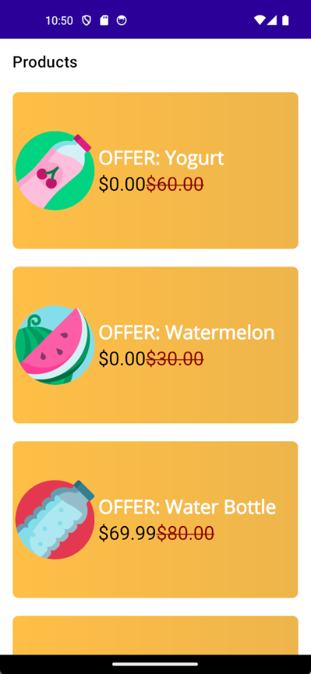
Changing the design of the products in the previous list, we will have the following result:

Without a doubt, this design is much more eye-catching. Now the question is, how can we use both designs in the list? We will see that next.
To determine which design to apply to each item at runtime, we will use a DataTemplateSelector. This is a very simple class that we need to inherit from to determine the resource to use, and it looks like this:
					    public class ProductTemplateSelector : DataTemplateSelector
    {
        protected override DataTemplate OnSelectTemplate(object item, BindableObject container)
        {
            throw new NotImplementedException();
        }
    }
You can see that by inheriting from DataTemplateSelector, we are required to implement the OnSelectTemplate method, which contains two arguments that allow us to carry out the design selection:
The great advantage of this approach is that we can use any comparison we want to determine the design to use. We could use an object property, a comparison, a filter, etc.
In my case, I will retrieve the product to which the item is being bound, and then I will use the HasOffer property defined in the model to determine whether the product is on sale or not:
					    public class ProductTemplateSelector : DataTemplateSelector
    {
        protected override DataTemplate OnSelectTemplate(object item, BindableObject container)
        {
            var product =
                 item as Product;
            if (!product.HasOffer)
            {
               //Product has offer
            }
            else
            {
               //Product has no offer
            }
            return new DataTemplate();
        }
    }
The final step is to determine which design to apply to the items based on the condition. There are several ways to do this, but it all depends on where you place the item designs.
You should do this by defining a DataTemplate for each design you want to apply, as well as an x:Key. In my case, I will do it in the resources of the CollectionView:
					<CollectionView ItemsSource="{Binding Products}">
    <CollectionView.Resources>
        <DataTemplate x:Key="ProductStyle">
            <Grid
                Margin="15,10,15,0"
                ColumnDefinitions=".1*,.2*,.7*"
                RowDefinitions="*,*">
                <Frame
                    Grid.RowSpan="2"
                    Grid.Column="1"
                    Grid.ColumnSpan="2"
                    BorderColor="White">
                    <Frame.Background>
                        <LinearGradientBrush EndPoint="1,0">
                            <GradientStop Offset="0" Color="#F8F9FA" />
                            <GradientStop Offset="1" Color="#DEE2E6" />
                        </LinearGradientBrush>
                    </Frame.Background>
                </Frame>
                <Image
                    Grid.RowSpan="2"
                    Grid.ColumnSpan="2"
                    HeightRequest="100"
                    Source="{Binding Image}" />
                <Label
                    Grid.Column="2"
                    FontSize="Large"
                    Text="{Binding Name}"
                    VerticalOptions="Center" />
                <Label
                    Grid.Row="1"
                    Grid.Column="2"
                    FontSize="Large"
                    Text="{Binding Price, StringFormat='{0:C}'}"
                    VerticalOptions="Center" />
            </Grid>
        </DataTemplate>
        <DataTemplate x:Key="OfferStyle">
            <Grid
                Margin="15,10,15,0"
                ColumnDefinitions=".3*,.7*"
                HeightRequest="200"
                RowDefinitions="*,*">
                <Frame
                    Grid.RowSpan="2"
                    Grid.ColumnSpan="2"
                    BorderColor="White">
                    <Frame.Background>
                        <LinearGradientBrush EndPoint="1,0">
                            <GradientStop Offset="0" Color="#FFBF47" />
                            <GradientStop Offset="1" Color="#EEB54C" />
                        </LinearGradientBrush>
                    </Frame.Background>
                </Frame>
                <Image
                    Grid.RowSpan="2"
                    HeightRequest="100"
                    Source="{Binding Image}" />
                <Label
                    Grid.Column="2"
                    FontAttributes="Bold"
                    FontSize="Title"
                    Text="{Binding Name, StringFormat='OFFER: {0}'}"
                    TextColor="White"
                    VerticalOptions="End" />
                <Label
                    Grid.Row="1"
                    Grid.Column="2"
                    FontAttributes="Bold"
                    FontSize="Title"
                    Text="{Binding Price, StringFormat='{0:C}'}"
                    TextColor="White"
                    VerticalOptions="Start">
                    <Label.FormattedText>
                        <FormattedString>
                            <Span Text="{Binding OfferPrice, StringFormat='{0:C}'}" />
                            <Span
                                Text="{Binding Price, StringFormat='{0:C}'}"
                                TextColor="DarkRed"
                                TextDecorations="Strikethrough" />
                        </FormattedString>
                    </Label.FormattedText>
                </Label>
            </Grid>
        </DataTemplate>
    </CollectionView.Resources>
    <CollectionView.ItemsLayout>
        <LinearItemsLayout ItemSpacing="10" Orientation="Vertical" />
    </CollectionView.ItemsLayout>
</CollectionView>
As we have already defined several DataTemplates, we can retrieve them and assign them to the CollectionView item according to our needs, as shown in the following example:
					    public class ProductTemplateSelector : DataTemplateSelector
    {
        protected override DataTemplate OnSelectTemplate(object item, BindableObject container)
        {
            var product =
                 item as Product;
            var collectionView = container as CollectionView;
            if (!product.HasOffer)
            {
               return (DataTemplate)collectionView.Resources["ProductStyle"];
            }
            else
            {
                return (DataTemplate)collectionView.Resources["OfferStyle"];
            }
            return new DataTemplate();
        }
    }
Finally, you need to specify in the CollectionView control that you will use the created selector, as follows:
					<ContentPage
    xmlns:selectors="clr-namespace:DataTemplateSelectorDemo.Selectors"
    ...>

    <ContentPage.Resources>
        <ResourceDictionary>
            <selectors:ProductTemplateSelector x:Key="ProductTemplateSelector" />
        </ResourceDictionary>
    </ContentPage.Resources>

    <CollectionView ItemTemplate="{StaticResource ProductTemplateSelector}" ItemsSource="{Binding Products}">
        ...
    </CollectionView>
</ContentPage>
With these changes, you will be ready to run the application, which looks like this:

I hope you find this post useful, and remember that I have a course on .NET MAUI where I explain this topic and many more step by step. See you in the next post!

Learn how to create cross-platform applications, thanks to the power of .NET MAUI and a series of real projects.

Hi Devs!Nice to have you around.Nice to have you around...

In this post, I will show you in more detail how I crea...

Gradients are a very simple way to add a better visual ...